Tzara
Continental
- Joined
- Aug 2, 2005
- Posts
- 7,661
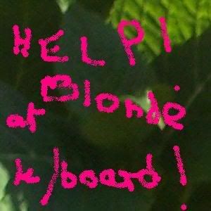
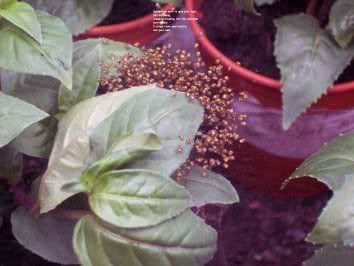
Thanks, J.Very good, thought provoking poem on your first attempt. You should do more. To improve this piece, I believe you need the text to pop, it is over powered by the red and all the eye sees is red since it's a bold color—and I can't see the color red, so you know that's something. I think if you can just ignore the first half detail of the image and darken it, your text portion of your illustrated poem will grab the reader too.
I find the form intimidating, since my Photoshop skills are nonexistent, aside from being able to start the program.
It's a very different challenge, though. Kind of fun.


