Saiyaman's artwork: the thread

Here's one for my fellow Dutch men.

This comic is depicting the lyrics of a Dutch Children's songs. About two bunnies sitting in a field playing flute and drums when all of a sudden a hunter shoots one of them, leaving the other grieving. (Man what mean songs are we teaching our kids anyway?) With a naughty twist, to "Playing Flute" and "Banging the drum"

Bunnies.jpg
 
Townshend.jpg


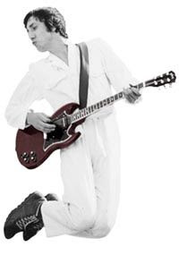
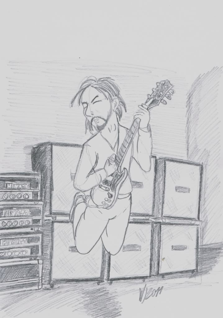
Well I was at the home of the singer in my band tonight and I had my sketch block with me and I suddenly had this picture of Pete Townshend leaping into the air in my head.

eg-pete-townsend.jpg


And so I started drawing just that and it came out way better than I though and it's only now that I can compare it to the picture that I can see how close I got without any visual aid.
 
Well guys, it has been a long time but here's an update of my ongoing comic.

Tiffany-5.jpg


Tiffany-6.jpg


Tiffany-7.jpg


Tiffany-8.jpg


Enjoy.
 
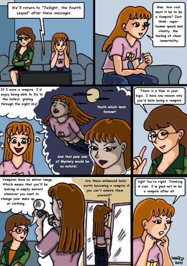
How does one describe inspiration? Well I posted a reply in a topic on another forum in which I basically stated that I didn't understand why series like "Twilight" are as big as they are.

But when I went to do my grocery shopping, I walked past a mirrored wall and all of a sudden I had this idea in my head. Those girls who are watching "Twilight" are doing so because of the way those vampires look and that aura of Mystery that surrounds them. And aspire to become Vampires themselves because of that, but there's a flaw in that logic.

And because I draw Daria fan art, I decided to depict it as such, Daria and her Younger sister Quinn are watching "twilight"

Vampiresisters.jpg
 
It has been a while since I posted anything but that doesn't mean that I have been sitting still.

Anyway in a Daria fan forum I opened this contest in which the contestants had to draw the characters according to the original 1995 concept drawings and show what the series could've been like if they stuck with the 1995 concepts.

To give you guys an example: THIS is the 1995 version of Daria herself.
flip1.gif

Wavy hair and a Greenpeace shirt.

If that's a departure, here's Jane, a punkrock girl with a partially shaved head.
flip3.gif
flip5.gif


And here's little sis Quinn
flip14.gif
flip12.gif


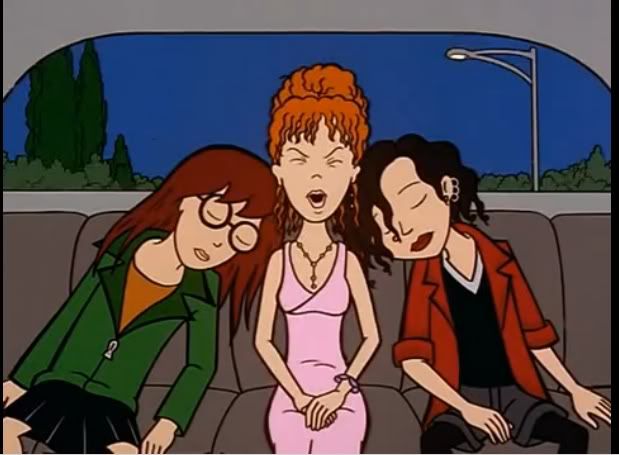
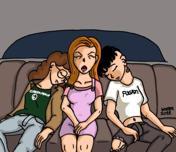
And so I took a scene from a real episode in which a very Sleepy Daria and Jane use Quinn as a pillow in the back of the Morgendorffer family car.
Eww.jpg


And turned it into this.
QuinnEww.jpg

Love the way this one turned out, Punkrock Jane in particular.
 
I don't get as much replies here, which is a shame but here's an update fr my ongoing story. Being a member of the Fashion club involves more than just trying out outfits and hair styles, being seductive is also a requirement.

Dinner-at-Tiffanys-page-9.jpg
 
I don't get as much replies here, which is a shame but here's an update fr my ongoing story.

You must not worry about getting replies or not but if you were to believe me .. i keep visiting your thread pretty often .. I really like your work. It is so simple and yet so incredible!!

Thank you for the opportunity to have a peek at your work. I would definitely like to see more and more of it.
 
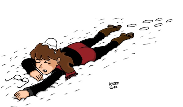
daria_in_the_snow_by_rastasaiyaman-d4pl9ej.jpg


My original intend for this one was to have Beavis and Butt-Head behind this. With Beavis Proclaiming to have scored that hit and Butt-Head cackling about Beavis' first score on a chick being with Diarrhea.

But I suck at drawing B&B and so I just left them out, just Daria having received a snowball at the back of her head.
 
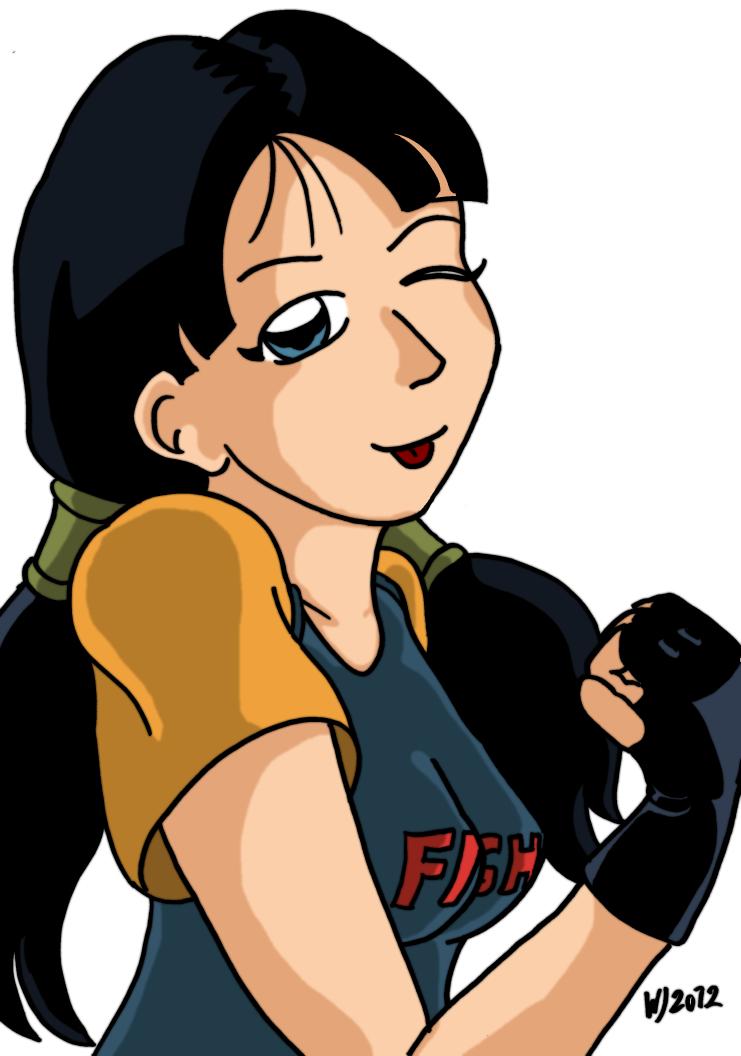
Well here's Videl Satan from Dragonball Z.
videl_satan_by_rastasaiyaman-d4quri3.jpg


I love strong female characters, even more when they aren't exactly sexbombs or visually imposing, somebody like Toph from "Avatar" for example or Jubilee from "X-men", Videl certainly falls into that category of "Underestimate this girl at your own perril."

I tried to make her look both tough and mischievous.
 
Here's Lucky Luke and Jolly Bumpers showing that even the Poor lonesome cowboy needs some relief every so now and then.

Lucky-Luke-and-Jolly-Bumpers.jpg
 
I wish that I got more responses on my thread but then again I can't force people.

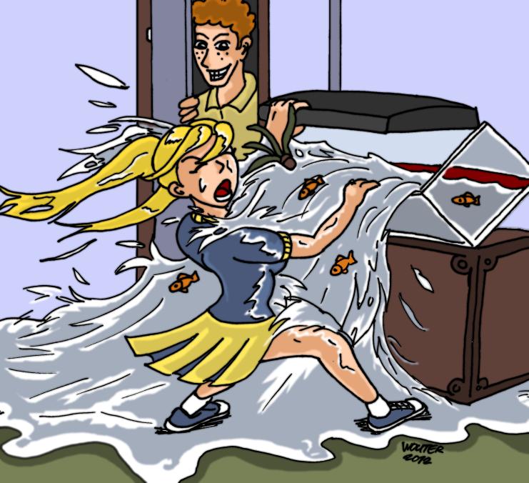
Anyway here's something new. There's a memorable scene from the season 1 episode "the Lab brat" in which a totally drenched Brittany shows up at the Morgendorffer household where she explains having to change the water in Upchuck's fishtank.

So how on earth could changing the water in a fishtank leave her in that disheveled state?

Well here's how...

daria__fishtank_follies_by_rastasaiyaman-d4xk3ks.jpg
 
Well here's Videl Satan from Dragonball Z.
videl_satan_by_rastasaiyaman-d4quri3.jpg


I love strong female characters, even more when they aren't exactly sexbombs or visually imposing, somebody like Toph from "Avatar" for example or Jubilee from "X-men", Videl certainly falls into that category of "Underestimate this girl at your own perril."

I tried to make her look both tough and mischievous.

Better treat a woman right Naruto...

Shannaro.big.jpg

YOU NEVER CEASE TO AMAZE ME!
 
That fishtank drawing was a very ambitious bit of subject matter to take on -- looks like you had fun doing it and you did it well.

However, I think your colored works have a major flaw, all of them. Your outlines are fuzzy and their weight is uniform in any given drawing. If you could figure out a way to make your outlines flow more naturally and complement the piece, you might really make an improvement. It takes a little extra time and maybe some zooming in, but lines should taper at the end and be thick in other areas.

In my own case, I rarely do coloring because the outlines are such a major part of the work for me. I don't have the software, and in the end it really is a matter of putting some very clean lines on paper, darkening them, and then creating a layer in PhotoShop set to "Darken" or "Linear Burn".

If you do the drawing from start to finish on the computer, you may want to fine tune the ends and significant edges of your outlines with some tools -- not polygonal lasso like me, I don't want you going down the path to frustration. Anyone have any ideas?

I'll link an image that I did for a forum elsewhere.. Meant to be viewed zoomed way out from where it is as shown. It's not that I'm a furry guy either -- but it does provide a good example of what I mean by tapering and line control, using my own stuff. Notice how the ends of her hair are actually points instead of rounded.

I'm by no means an expert at line control, but you could really be pleased with the impact that a change in technique could have for the overall aesthetics.
 

Attachments

  • k-fox.jpg
    k-fox.jpg
    33.5 KB · Views: 119
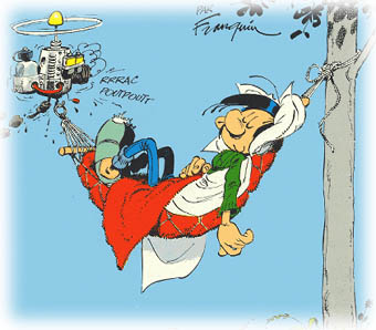
Wet-Special, I am inspired by artists like Charles M Schulz who just draw with thick lines but at the same time I'm also inspired by somebody like Andre Franquin who had this really rough but at the same time fluent style and although my work is clearly Manga, I mix up a lot of European influence as well.
gaston-dodo.jpg

Andre Franquin, in Europe he's regarded as the greatest comic book artists of all time.

Schulz' influence also comes from the "Let the pictures tell the story" and me not really bothering with backgrounds too much (although my "Brushed off" story deviates from that, the opening pages in that art supply store and the leading lady arriving at her art studio were the result of much sketching to get it right.)

All my drawings are done on paper with Pencil and after I'm satisfied with the look, thickened up with felt tip pens which I love for their feel, Identipen have been my firm favorite from the start.

Unused-page-for-my-Daria-story-Through-a-Webcam-lens-darkly.big.jpg

This is an unused sketch from a story I did showing to good effect my way of working.

For years I have used MS Paint to color my work. Resulting in a kind of rough look.
Magic-Potion.big.jpg


But I have switched to using Paint.net which enables me to soften the overall look with something called "Gaussian blur" it melds the colors together.
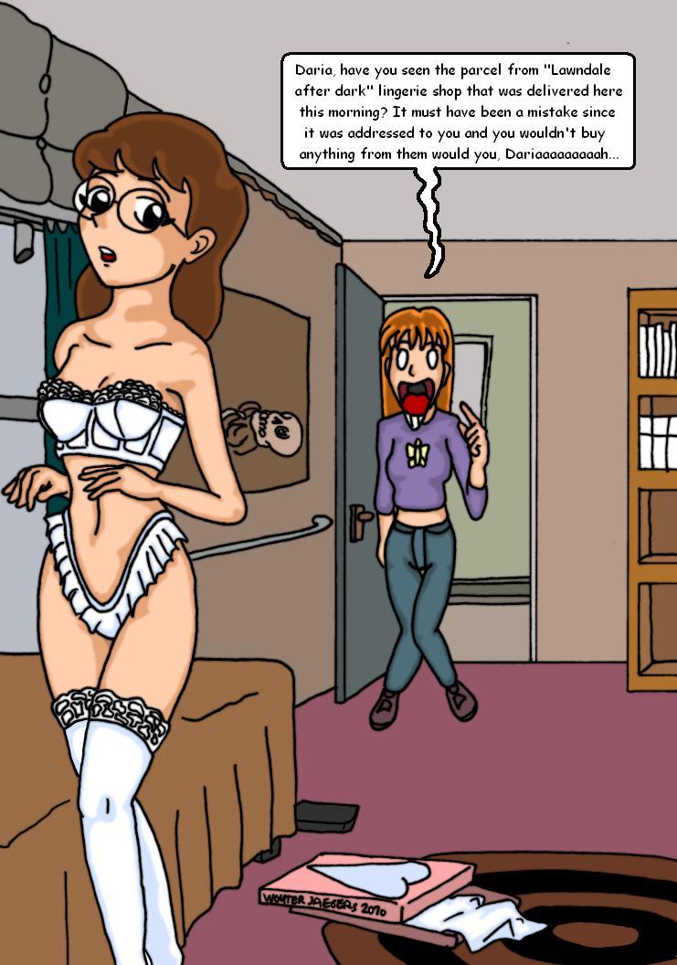
daria_lingerie_by_rastasaiyaman-d4olufz.jpg


I stuck with that because of loving the results. But Occasionally I draw something and use a 6B pencil to give it grey tints.
Skywalkers.big.jpg


The thing with the fish tank was one such occurance where it just came flowing (no pun intended) out of my pencil onto the paper, I tried to elaborate on the water splashing, hitting the girl but the innitial sketch was so good I couldn't really change it to improve it.

That Naruto picture is another good example of that happening, I actually was standing upright with a piece of paper and it just came out the way you see it.
 
Gaussian blur... I see. I'm afraid I can't approve of Gaussian blur, it's a bit of a crutch ultimately.

Felt tip pen, interesting. I start to get how you get your lines. Felt would probably work well if you were drawing on a larger board. I hate to say that because I don't buy those big bristol boards anymore, and my scanner's max size is legal.

Lines are a real challenge and for a hobby what you're doing is outstanding. I hope I didn't strike a nerve.

I'm not surprised by the inspirations you point to. I saw the manga style, but also I was somehow reminded of Tin Tin or Asterix and Obelix based on your choice of bright, flat colors. That's always good, and I would say .. if I were you, I'd keep imitating what you like closely, and look for more techniques that you might be able to incorporate, because Gaussian blur to me seems like a cop out. By-the-by, they have that in Photoshop too if you wanted to try that.
 
Well as has been shown throughout the series, Brittany loves to let her eyes roam (and her hands and god knows what else) and she's not very good about keeping quiet about it or keeping it a secret.

In my new piece she forgot one detail when covering up her tracks...

Daria-Too-much-information.jpg
 
Here is some of my art work...

This is my design for a new story. Everything is done by me, the sketch as well as the design.
Ooops, I forgot I have to reduce the size.
I'll post it later.
 

Attachments

  • Book cover, example.jpg
    Book cover, example.jpg
    23.1 KB · Views: 121
Last edited:
This is my design for a new story. Everything is done by me, the sketch as well as the design.
Ooops, I forgot I have to reduce the size.
I'll post it later.

Nice pose she reminds me of Annie Lennox. But why did you post this in a thread about my artworks, why didn't you start a new thread here?
 
Re Daria

Pretty good. Graphics are nicely rendered, if occasionally touching on "anime".

Your writing though --

No specific character voices. No real attempt to marry the tone of the original "Daria" with your fan fic. Expository and pedantic. You use eight sentences when five words will do. And you too often miss opportunities (except the most obvious moments, like "cumming") to let the visuals tell the story instead of the text. (And it's a good thing I'm not wearing my Spelling and Grammar Nazi hat today.)

Get yourself a writing partner, and you should do well.
 
Well I have been on a "Legend of Korra" binge lately and I have been re-watching the "Last air bender" series and having a ball with how good both series are.

And then I suddenly had a vision of Daria in the Avatar state and that developed into seeing Jane as a Firebender and Jodie as a Waterbender. So I took out my pencils and scribbled down something just like that.

avatar_daria__fire_bender_jane_by_rastasaiyaman-d56jz2c.jpg

I'm pleased with how this one came out.
 
Back
Top